Millions of people see the Starbucks logo every day, but almost nobody notices its clever hidden detail. That green siren smiling from your coffee cup contains an ingenious design trick that makes her more relatable than you might realize.

The logo’s evolution tells an interesting story. What began in 1971 as a detailed brown mermaid transformed over decades into today’s minimalist green emblem. While the design became simpler, the psychological strategy behind it grew more sophisticated. The 2011 removal of text made the siren the sole focus, allowing her subtle personality to shine through.

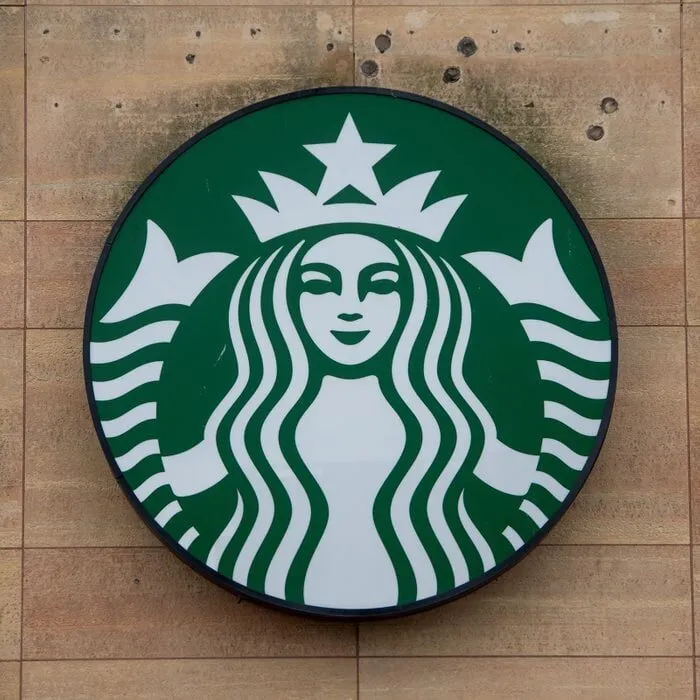
Examine her face closely and you’ll discover intentional imperfections. The right side of her face appears slightly shadowed, her nose has a subtle tilt, and her features aren’t perfectly symmetrical. These weren’t accidents but carefully crafted elements meant to create an emotional connection.


Starbucks designers understood that flawless symmetry feels cold and artificial to our brains. By adding these tiny “flaws,” they made the siren feel more human and approachable. It’s a brilliant example of how world-class branding combines art with psychology. Next time you sip your coffee, take a moment to appreciate this thoughtful detail hiding in plain sight.